Help
For a very fast and concise introduction to Recent Train Times please see the Overview page.
For a more detailed walkthrough, please see the information below.
Contents
Example: Derby to Birmingham
Completing the Search Form
Understanding the Results
Seeing Actual Recent Train Times
Using the Results
More Advanced Options
Filtering by Train Company
Changing the Arrival Statistic
Displaying all of the Arrival Statistics
Displaying Other Basic Statistics
Displaying Other More Advanced Statistics
Average and Range Calculations
Daily Summary
Arrival Time Graph
Hiding Uninteresting Services
Statistic Definition Options
Interpolated Station Timings
Cancellations and Arrival Statistics
Displaying More Actual Arrival Times
Other Examples
Good performance on the Liskeard to Looe Branch Line
Poor performance on the West Midlands Cross City Line
The One Train per Day from/to Polesworth
Extremely Frequent: Waterloo to Clapham Junction
Example: Derby to Birmingham
Completing the Search Form
Imagine we need to travel from Derby to Birmingham, on a weekday, in the morning.
We can use Recent Train Times to see which trains have recently been running on time.
Into the search form, enter Derby into the "From" box. After typing the first few letters, a list will appear that we can select from. Into the "To" box, enter Birmingham New Street. Finally, check that between 6am and 10am is selected from the time list.
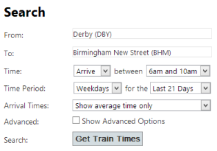
Next, click "Get Train Times". The following results are shown:
[ Back To Contents ]
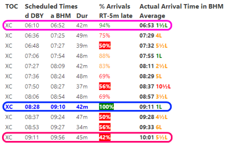
Understanding the Results
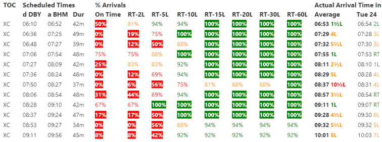
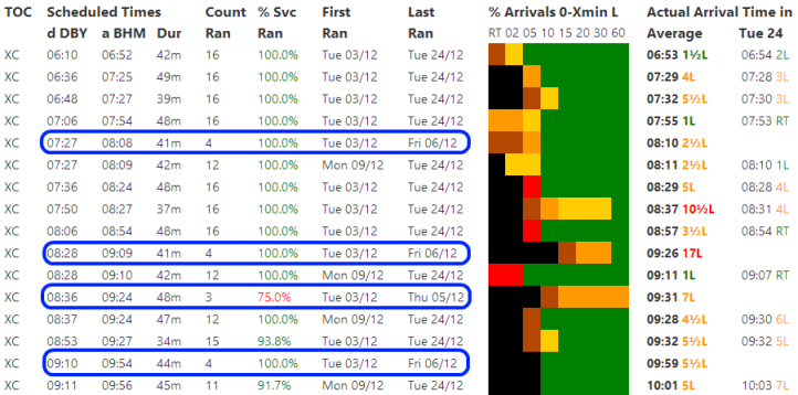
Each line in the list is a train schedule (i.e. a departure time for a train from Derby and an arrival time for the train in Birmingham). The first line above, circled in pink, describes a Cross Country service scheduled to leave Derby at 06:10 and arrive in Birmingham at 06:52, a journey lasting 42 minutes. This is all schedule information.
The next columns describe the recent performance of the service. We can see that around 94% of the time (in the past three weeks) this service has arrived five minutes or less late (see the "% Arrivals Right Time up to 5 minutes late" column). Averaging all of the recent arrival times in this period gives an average actual arrival time of 06:53, 1.5 minutes later than the scheduled time.
Reading down the list we can see several services with poorer performance, the worst in this period (by this measure) being the 09:11 departure from Derby scheduled to arrive in Birmingham at 09:56, circled in red above, which arrives less than 5 minutes late less than half the time.
The best performer has been the 08:28 departure from Derby scheduled to arrive in Birmingham at 09:10, circled in blue above, arriving within five minutes of the scheduled time 100% of the time (in the time period covered by this search).
[ Back To Contents ]
Seeing Actual Recent Train Times
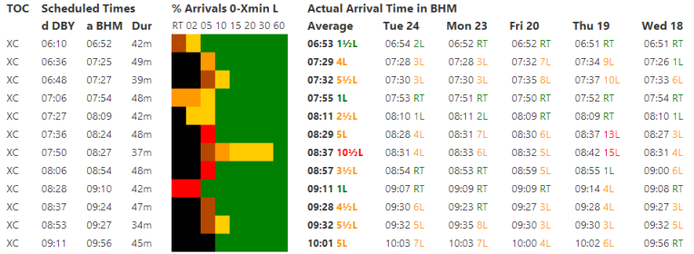
Suppose that instead of just the % arrivals less than five minutes late and the average arrival time we also want to see the actual times for these services over the past few weeks.
In the Quick Options panel at the top of the search results page, click on "Show Actual Arrival Times". Alternatively, in the search form, change the Arrival Times option to "Show average & actual times" then click "Get Train Times" to search again. The following results are shown:
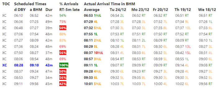
As well as all of the same columns that were displayed previously, some additional columns are now also shown. These show some actual arrival times for recent dates in the specified time period. The most recent dates are first, going back in time as we read further across. By default, actual arrival times are only shown for the last five dates in the specified time period. This number can be increased using one of the advanced search options, described later.
Clicking on one of these times will open a new tab/window giving more information about the selected service, e.g. clicking on the 06:54 arrival at Birmingham on Tuesday 24th December:
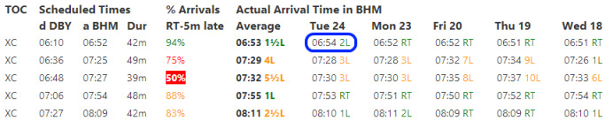
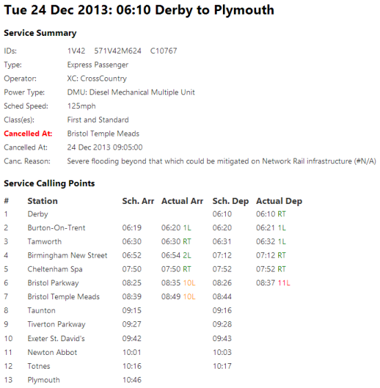
From this we can see that on this day, the 06:10 service from Derby (scheduled to continue to Plymouth) departed Derby on time and arrived in Birmingham two minutes late. We can also see that on this date this service was cancelled at Bristol due to flooding.
[ Back To Contents ]
Using the Results
Just because a particular service has generally arrived on time recently is no guarantee that it will in the future. There may have been unusual circumstances influencing the performance of rail services in the recent past that don't apply in the future.
Still, Recent Train Times provides easy access to information that should, generally speaking, allow you to plan your journeys better.
Examples of how to use the information could include avoiding times/services/routes susceptible to delays. Another use could be working out the amount of time to leave between trains when changing from one train to another (i.e. if the first train is more than 5 minutes late 70% of the time, it is better to leave a few extra minutes between trains).
Ultimately interpreting the information is not an exact science and different interpretations are possible!
[ Back To Contents ]
More Advanced Options
The search described above is the simplest search. What follows now is a description of some of the more advanced options.
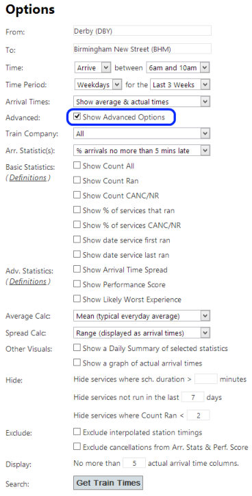
Ticking the "Show Advanced Options" box expands the search form:
[ Back To Contents ]
Filtering by Train Company
The Train Company drop down list allows the results to be filtered to a single train operating company only. This can be useful on some high frequency routes to eliminate slower/faster services that aren't of interest. E.g. if travelling between London Euston and Birmingham, this option could be used to remove the slower London Midland services to focus only on those provided by Virgin Trains.
[ Back To Contents ]
Changing the Arrival Statistic
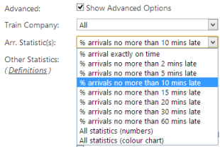
By default, the search results display the percentage of arrivals at your destination that are no more than 5 minutes late ("% Arrivals RT-5m late"). Perhaps you would rather measure the percentage of arrivals that are no more than 10 minutes late. Changing the Arrival Statistic(s) option, either in the Quick Options panel at the top of the search results page or in the Advanced Options as shown below, allows you to select this.
In our example, this yields the following results:
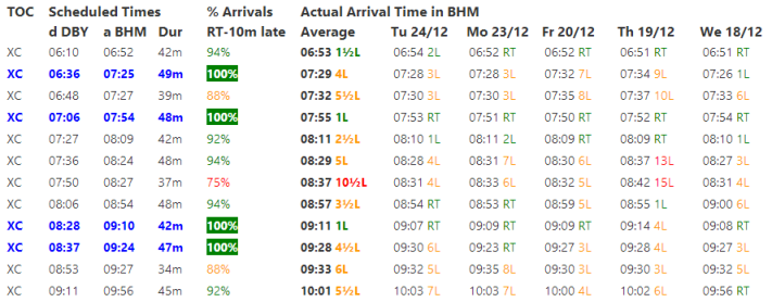
As we have selected a performance measure that is easier to meet, it is not surprising that the percentage of trains meeting the measure has increased for each schedule. This has also updated the set of best performing services (highlighted in blue) according to the values of the newly selected statistic.
[ Back To Contents ]
Displaying all of the Arrival Statistics
Instead of only displaying a single column (e.g. RT-5m late or RT-10m late, etc) it is possible to display all of the possible statistics at once by selecting the "All Statistics (numbers)" option (not available in the Quick Options panel, only available in the advanced options in the full search form):
As seen above, this leads to a lot of numbers. An alternative, more compact, visual and instant way of visualising this same information is to click on either the "Cht" (for Chart) in the Quick Options panel or select the "All Statistics (colour chart)" option in the search form:
Greens and yellows show where a high percentage of the services meet that performance measure. Darker colours such as orange, red, brown and black show ever smaller percentages of services meeting the measure. The further to the right the blacks, browns and reds persist on each line, the greater the length of the delays.
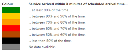
The full key, also shown underneath the search results, is:
Focussing in on a couple of places, for example:
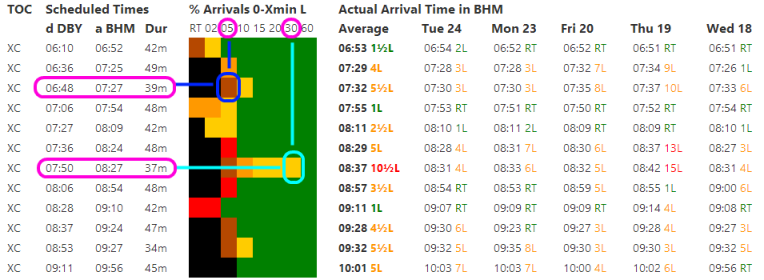
The dark blue circle covers an area shaded brown. This shows that the 06:48 from Derby arrived within five minutes only between 50 and 60 percent of the time.
The light blue circle covers an area shaded yellow. This shows that the 07:50 from Derby arrived within thirty minutes between 80 and 90 percent of the time.
[ Back To Contents ]
Displaying Other Basic Statistics
Using the advanced options it is possible to display some other basic statistics, for example:
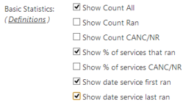
The additional statistics that have been selected are then displayed in the search results, as shown in the columns circled in blue below:
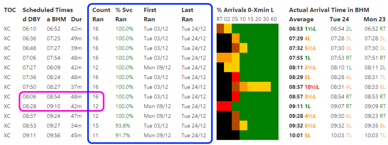
In the example above, the count of the number of times each service schedule has run is not always the same - see the numbers circled in pink as an example. This can be due to a variety of factors, including special timetables due to bad weather, leaf fall, etc. In this example, it is because the time period covered by these search results includes a timetable change (the 08:06 departure ran in both the last timetable and the current one where as the 08:28 only started in the current timetable).
[ Back To Contents ]
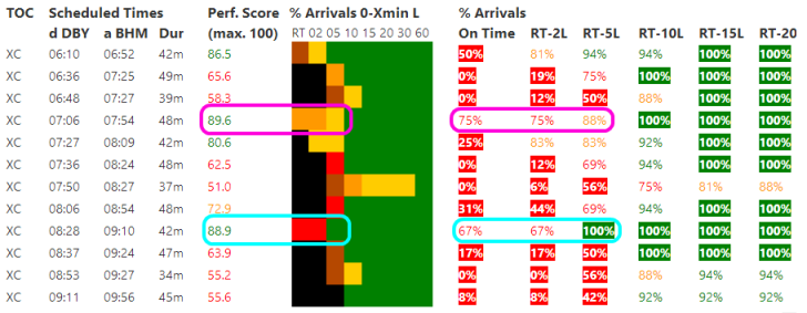
Displaying Other More Advanced Statistics
Using the advanced options it is possible to display some other more advanced statistics, for example:
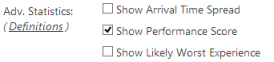
The Arrival Spread shows how wide the range of arrival times for each service is. Three different methods of calculating this are supported - these are described in more detail below.
The Performance Score is another statistic that can be enabled here. This is a more general measure that considers both the number of delays and the length of the delays. In order to score highly, the number of delayed trains must be low and the length of any delays must be low. This is illustrated in the Derby to Birmingham example below (this screenshot includes the arrival statistics both as a colour chart and numerical statistics for easier cross-comparison):
By the Performance Score statistic, the best performer is now the 07:54 arrival in Birmingham, circled in pink above. What was previously the best performer, the 09:10 arrival, circled in light blue above, is now in 2nd place, though the difference is small. Although the 09:10 arrival more often arrived five or less minutes late, it arrived on time less often and also arrived two or less minutes late less often (compared to the 07:54 arrival).
The Likely Worst Experience (LWE) indicator provides an indication of the probable latest arrival time for each service. This is calculated by discarding the worst 20% of arrival times for each service in the search time period, then returning the worst performance from the remaining 80%. In other words, you would be unlucky (less than a 1 in 5 chance) to experience a performance worse than this. A good example of how this works is for a journey from Derby to Edinburgh:
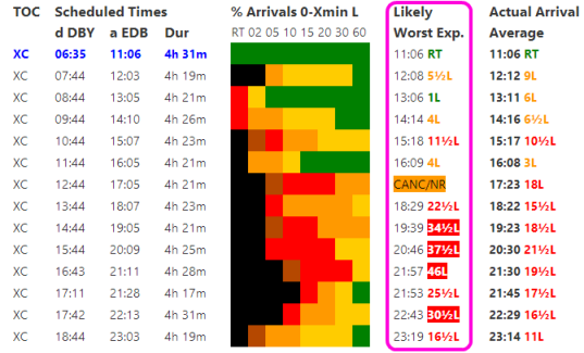
The LWE, circled in pink above, behaves differently to the average arrival time (note how some LWE times are earlier than the average arrival time and some are later). It makes clear that travelling earlier in the day on this route is definitely a good idea - the probable worst delay being that much less earlier in the day. Interestingly, the 12:44 departure from Derby has been cancelled so often that the Likely Worst Experience indicator shows this service may well be cancelled (more than 20% of the time).
[ Back To Contents ]
Average and Range Calculations
Using the advanced options it is possible to change how the Average Arrival Time and the Arrival Spread are calculated:
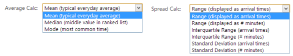
A brief discussion of the different types of calculation is given below. For more details, please see Wikipedia.
Mean: The Mean is the most widely known everyday average in use. It considers all of the arrival times but very large delays can distort the average. Since the Mean is a mathematical expression, cancellations must be converted to a numerical value (an effective delay value in minutes). This is done as follows: Scheduled journey duration over 2 hours = a delay of 60 minutes. Scheduled duration 1 - 2 hours = a delay of 30 minutes. Scheduled duration less than 1 hour = a delay of 15 minutes.
Median: The Median is the mid-point value in the list of arrival times ranked in order of delay length. It less susceptible to single extremely large delays distorting the average and is therefore known as a Robust Statistic. The value of the Median is not based directly on all of the arrival times (only the middle one matters). It can consider cancellations without the need to convert them to an effective delay.
Mode: The Mode is the most common arrival time. Since the arrival times can be widely dispersed a grouping algorithm is used that groups up from intervals of 1 minute up to 5 minute bands until the most common value is found. The value of the Mode is also not based directly on all of the arrival times. It can also consider cancellations without the need to convert them to an effective delay.
Range: The range simply finds the earliest and latest arrival times. If there have been cancellations it will display both the earliest/latest arrival time of those services that weren't cancelled as well as an indicator showing one or more services were cancelled.
Interquartile Range: The Interquartile Range is related to the median and calculated from the lower and upper quartiles. It considers cancellations without the need to convert them to an effective delay. Unlike the range, the IQR will display either a time or a cancellation indicator, but not both.
Standard Deviation: The Standard Deviation is related to the mean. Like the mean it requires that cancellations be converted to an effective delay length (and uses the same rules as those used for the mean as described above).
[ Back To Contents ]
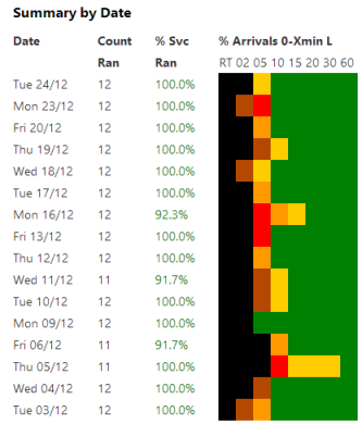
Daily Summary
Selecting either "Show Daily Summary" in the Quick Options panel or selecting the advanced option 'Show a Daily Summary of selected statistics' allows a daily summary to be included in the results. This shows the same statistics as the main search results, aggregated to day level rather than the more detailed level of individual service schedules:
[ Back To Contents ]
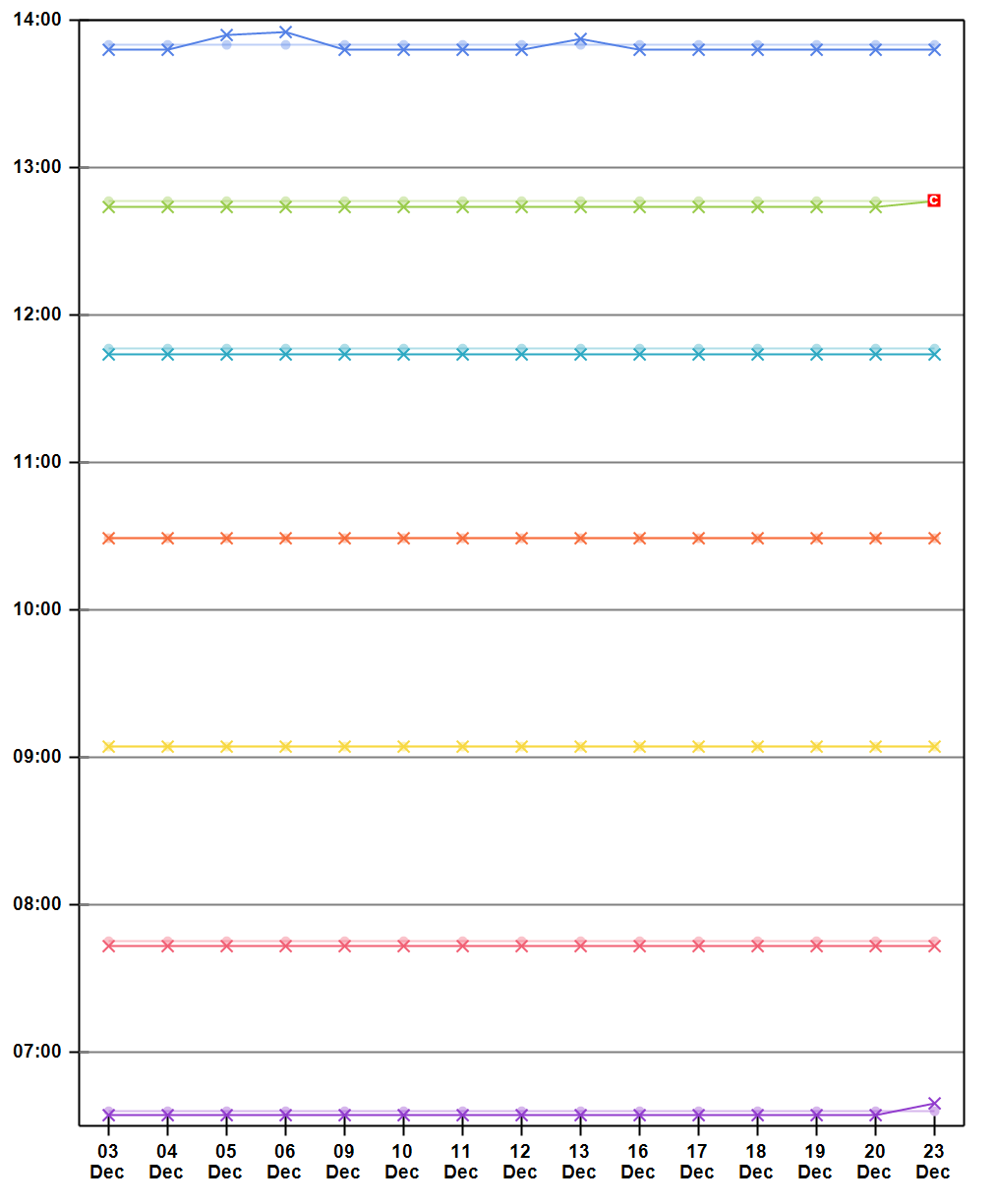
Arrival Time Graph
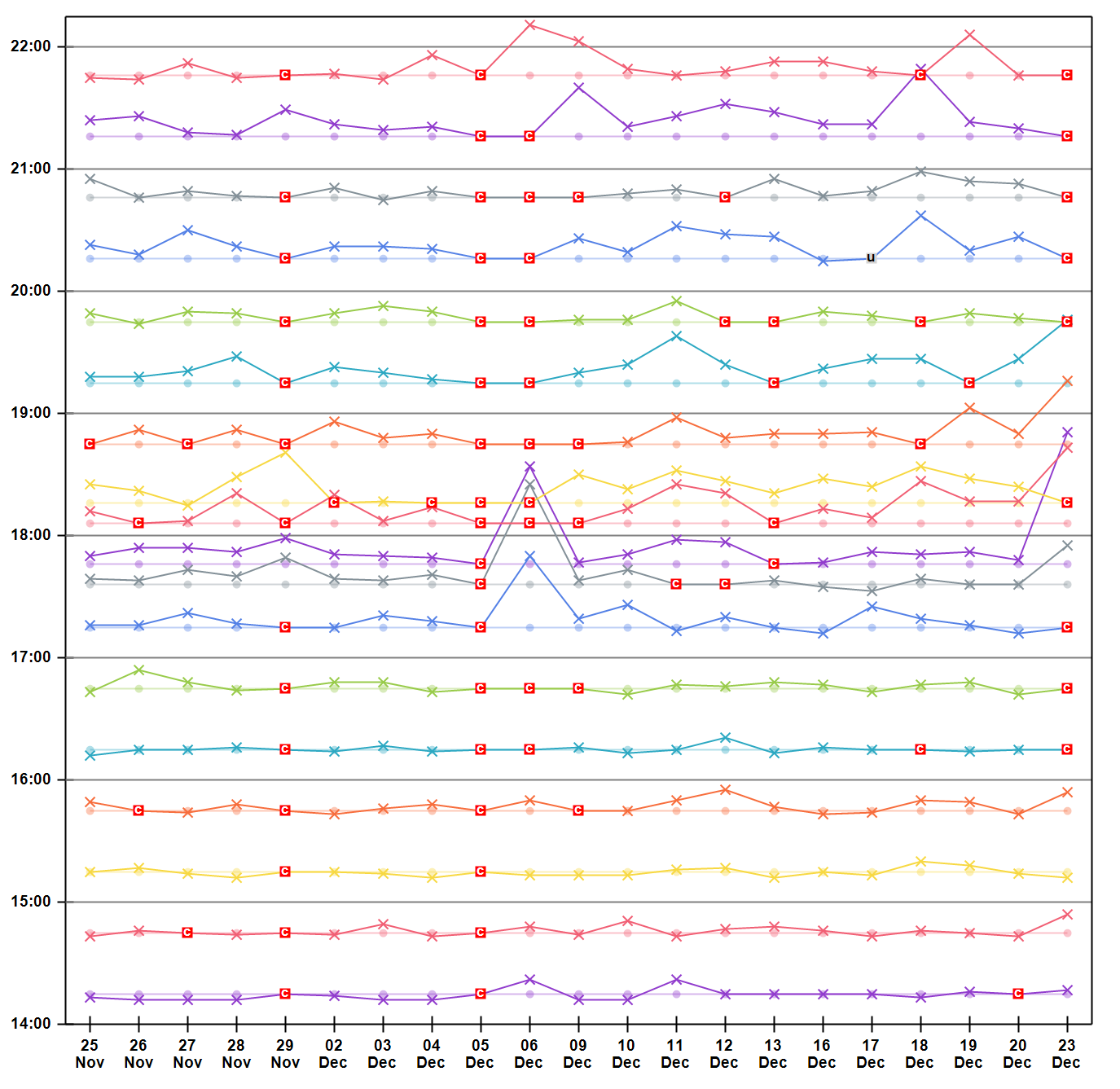
Selecting either "Show Arrival Graph" in the Quick Options panel or selecting the advanced option 'Show a graph of actual arrival times' creates a chart that graphically displays the actual arrival times for all of the services in the search results. In the Derby to Birmingham example, this looks as follows (click to enlarge):
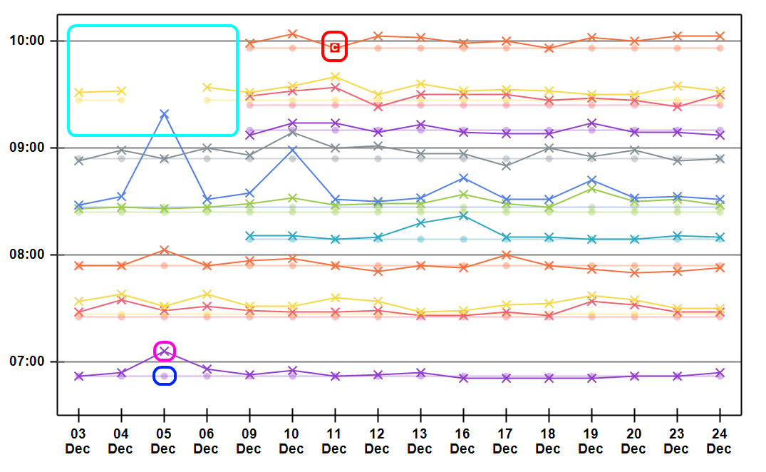
Scheduled times are plotted on the chart as faded dots and lines, for example the dot circled in blue represents a scheduled arrival at Birmingham New Street at 6:52am on 5th December. Actual times are plotted as bolder crosses and lines, for example the cross circled in pink represents the corresponding actual arrival time on 5th December, which was 7:06am. Note how the scheduled time and corresponding actual times are in the same colour (with the scheduled times being the lighter of the two colours), allowing easier comparison between schedule and actual.
Cancellations are also plotted on the chart, as red squares containing a white 'C', for example the point circled in red shows that the 9:56am arrival on 11th December was cancelled.
Sometimes gaps appear on the arrival charts. This can be due to public holidays, emergency timetables, or timetable changes. In the example above, the area of the graph circled in light blue near the top left of the chart is largely empty because on these dates an older timetable was in operation and the 'Hide' settings described below have been specified to hide any services that have not run in the last seven days.
[ Back To Contents ]
Hiding Uninteresting Services
Sometimes, service schedules appear in the results that aren't of interest. These can often be hidden using a combination of the following advanced options:
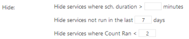
On some routes there are many slower, stopping services as well as faster, express services. The first option allows many of the slower services to be hidden by specifying a maximum scheduled journey time.
The next option allows service schedules that aren't current to be hidden. In this Derby to Birmingham example the specified time period covers a timetable change. As a result some service schedules have been retimed. These 'older' schedules are often less relevant so are hidden by this default rule. Removing the default value of 7 in this example unhides four service schedules from the previous timetable, circled in blue below:
In the example above, all four of the these services still run but have been very slightly retimed in the current timetable - see the rows immediately above/below each circled row for the current very similarly timed schedules.
The final Hide option allows services that have only run a small number of times in the specified time period to be hidden. By default schedules that have run only once are hidden. This can be useful to eliminate from the results schedules that are due to emergency timetables, e.g. during extreme weather incidents.
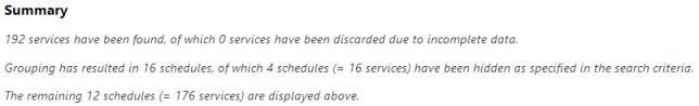
The Summary text that is displayed as part of the search results provides an overview of how many schedules (and services) have been hidden as a result of these options, e.g. hiding any schedule that hasn't run in the past seven days (the default rule) in our example results in:
[ Back To Contents ]
Statistic Definition Options
The following two advanced options provide a little more control over how some of the statistics are calculated:
[ Back To Contents ]
Interpolated Station Timings
Not every station location on the national rail network reports actual train times.
To work around this, Recent Train Times interpolates times for intermediate stations where no report exists. This is based on the actual reported times at the previous and next stations. For example, consider the following:
Station A: Scheduled Time = 10:00, Actual Time = 10:00 = 0 minutes late
Station B: Scheduled Time = 10:10, Actual Time = No Report
Station C: Scheduled Time = 10:20, Actual Time = 10:30 = 10 minutes late
Based on the scheduled times, Station B is midway between Stations A and C. Therefore, the actual arrival time at station B is estimated to 5 minutes late, i.e. 10:15.
This interpolation approach is not perfect, but is far better than nothing. Without it, those stations that don't report wouldn't work with Recent Train Times at all.
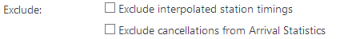
However, should you wish to, these interpolated times can be eliminated by checking the relevant "Exclude" option here.
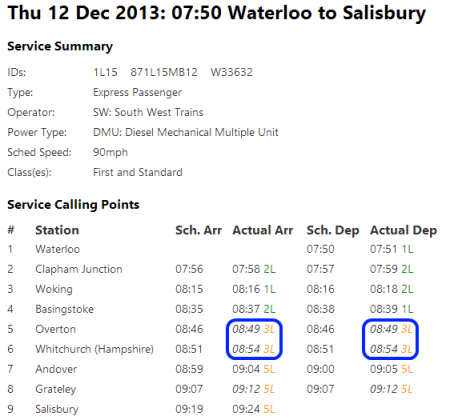
When viewing actual times, if the time has been interpolated it is displayed in italics as seen in the example service below at Overton and Whitchurch.
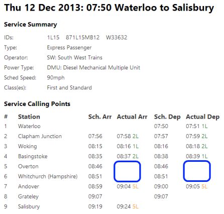
If interpolated timings are excluded, the same service details appear as:
Since locations tend to report for either most/all services or none at all, if interpolated times are excluded and then we search for times from Waterloo to Overton, the following results are returned:
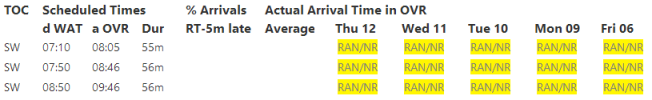
The RAN/NR values indicate that a service ran and very likely stopped at this station, but that no exact actual reported arrival times are recorded.
The above illustrates why interpolated times are clearly better than no times at all!
In summary, interpolated times provide a reasonably accurate picture of train performance at the stations that don't report, if not precisely the true picture. Exclude them if you require only properly reported actual times and are happy to accept incomplete or wholly missing times for some locations.
[ Back To Contents ]
Cancellations and Arrival Statistics
By default, cancellations are not excluded from the Arrival Statistics (such as % Arrivals RT-5m late), e.g. if three trains ran, all on time and a fourth was cancelled, the statistic % Arrivals RT-5m late = 75%.
Excluding cancellations from the Arrival Statistics would mean, in the above example, % Arrivals RT-5m late = 100%.
[ Back To Contents ]
Displaying More Actual Arrival Times
When the Arrival Times option = "Show average and actual times", actual arrival times are only shown by default for the five most recent dates in the specified time period. This setting allows actual arrival times for more dates to be shown.
Other Examples
Good performance on the Liskeard to Looe Branch Line
The performance chart below shows good all-round all-day performance on the Liskeard to Looe Branch Line in the South West of England.
The corresponding arrival time graphs also show actual arrival times consistently very close to (and often earlier than) the scheduled times (click to enlarge):
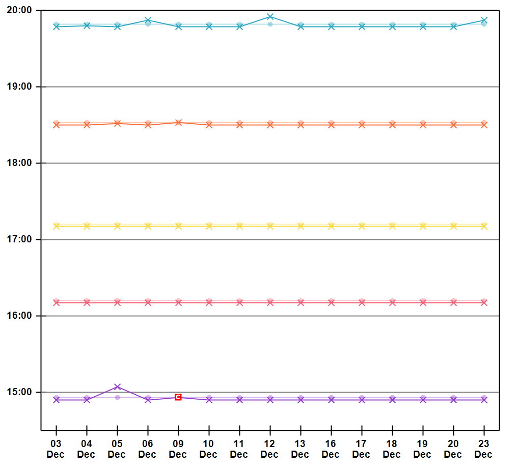
That performance on this line is so high is not all that surprising since the line is self contained with only simple there-and-back shuttle services operating.
[ Back To Contents ]
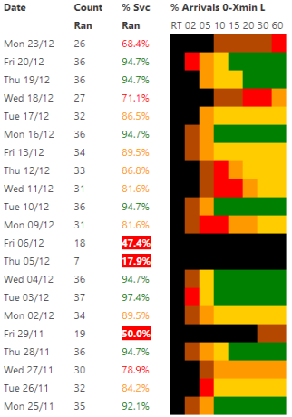
Poor performance on the West Midlands Cross City Line
The performance chart below shows poor performance in the evening peak on the northern part of the Cross City line between Birmingham New Street and Lichfield Trent Valley in the West Midlands.
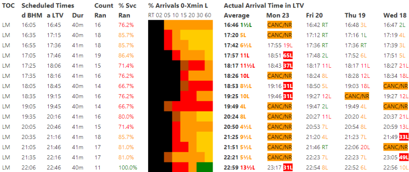
This line is renowned as a poor performer, especially in Autumn, and the above shows precisely that!
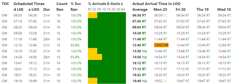
The Daily Summary chart shows on some days performance is not too bad but on other days the line completely goes to pieces. It is also clear that services to Lichfield Trent Valley consistently suffer from relatively high levels of cancellations:
This is also reflected in the arrival time chart (see below, click to enlarge). This shows reasonable performance in the early afternoon, in contrast to much worse performance in the evening peak. Overall there is a quite amazing number of cancellations - only six days out of the 21 shown here have no cancellations in the evening peak (4pm to 8pm):
[ Back To Contents ]
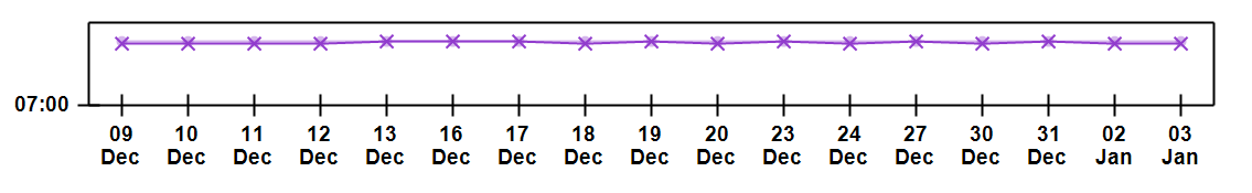
The One Train per Day from/to Polesworth
Only one train per day calls at Polesworth station, on the Trent Valley Line in the West Midlands. This Parliamentary Train runs northbound. There is no corresponding southbound service, largely because it is impossible to get onto / off the southbound platform since the footbridge was removed in 2005! Strangely, passenger usage has actually been sharply rising in recent years as the station has become more well known as a ghost-station.
[ Back To Contents ]
Extremely Frequent: Waterloo to Clapham Junction
The 24 hour arrival chart is very busy and looks either like a piece of modern art or childrens scribble:

[ Back To Contents ]